Swift and Sons Tasting Menu Graphics
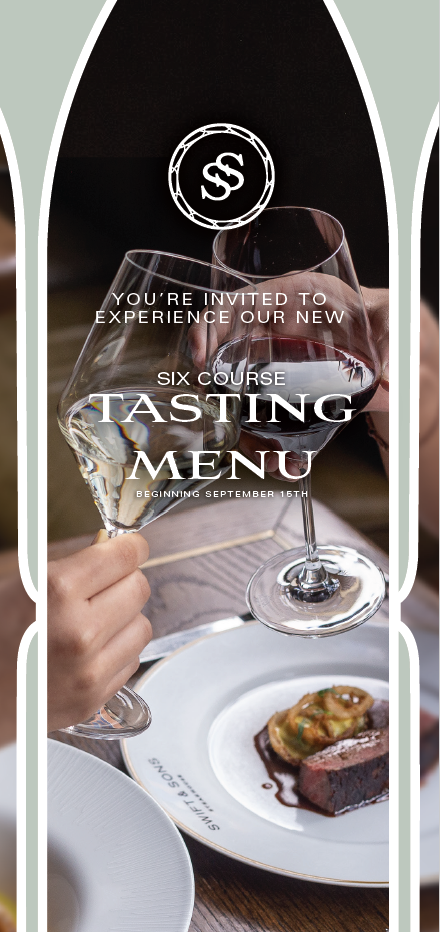
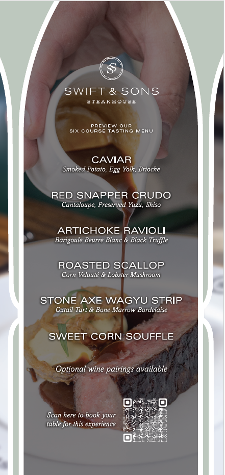
For this project I was tasked to make graphics for the swift and sons tasting menu. For this design I had to work a lot with photography as well as graphic design style. One aesthetic that Swift and Sons use are these white lines and I figured it would be fun to use them as a type of frame to hold the photography. This also gives it a nice style almost as if you are opening up a gate to the food/event. For this project they needed instagram social graphics and check presenters.
Made in Adobe Illustrator
Social Graphics


Check Presenters

